

Site for smartphones and tablets (responsive design)
InSite and OutSite sites automatically adapt to the dimensions of a browser window ('responsive design'). Many parts of the site automatically scale to the dimensions of the screen. This allows the site to be displayed correctly on other devices, such as a tablet, as well.
A normal website that has been created for display on a monitor is less suitable for smartphones. That is why you can change a site to make it suitable for smartphones (mobile site). If the site is opened using a smartphone, the mobile site is displayed instead of the standard site.
- The mobile site has a layout that works well on a smartphone: elements are placed beneath each other in a logical order.
- No margins are applied so the use of the screen area is optimised.
- On the mobile site you use the pages that are suitable for display on a smartphone. These can be pages that are shown on the standard site too. However, you can also add pages that are only used on the mobile site or exclude pages from display on the mobile site.
|
Content |
Video
Description
The standard site (for regular monitors) and the mobile site have the same URL, for example https://12345.afasonline.nl). If you use a mobile site, the pages of the site are automatically adapted to the device type. You apply this as follows:
- Desktop (standard site)
The standard site is intended for PCs and tablets in landscape mode.
- Mobile
The mobile site is intended for smartphones and tablets in portrait mode.
If you do not use the mobile site, the standard site is always displayed. You determine this in the settings.
Presentation of the mobile site
A mobile site always takes into account the width of the mobile screen. The maximum width of the site as a whole only applies to the standard site, not to mobile sites.
Margins, regardless of the level they are on, are not applied to the mobile site:
- The margin (left/right) of the site only applies to the standard site.
- The margins (left/right/top/bottom) of specific parts, such as banners, groupings and overviews, only apply to the standard site.
The background image of the standard site is not used on the mobile site.
Layout of the mobile site
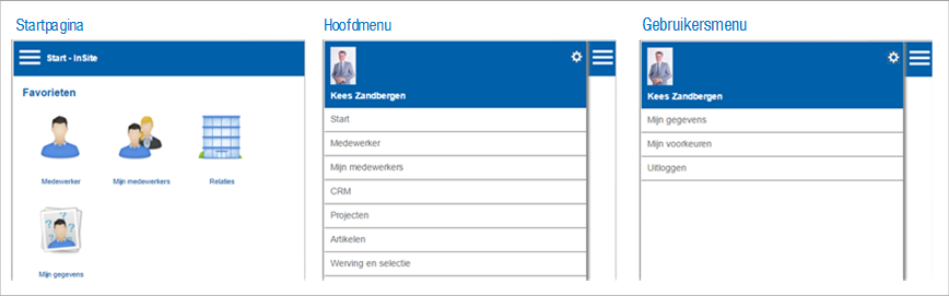
The home page of the standard site also is the home page of the mobile site. Other items of the main menu are accessible via the 'Hamburger menu' (top left). If the Hamburger menu is open, users can access their personal settings via the cogwheel icon.
You can create page parts for exclusive use in your mobile site and on the other hand you can determine that pages and page parts are not intended for the mobile site.