
Visualisations on a page
All elements on a page that are based on Profit data, are visualisations. Bar charts and graphs are examples of visualisations. Below are some examples of some visualisation types.
|
Contents |
Indicators
Indicators (also known as Key Performance Indicators - KPIs) are usually at the top of the page. The indicators provide insight in the most important information at a glance.
To view the indicators:
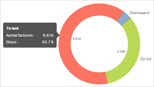
Donut
A donut shows a distribution, for example the distribution of expired and non-expired outstanding items.
To view a visualisation:
- If you let the cursor hover above a part of the visualisation (do not click), you see a text balloon with extra information.
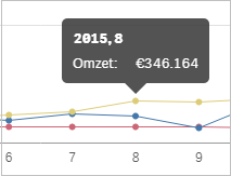
Graphs
Graphs often show a development (for example, over time) or a breakdown (for example, turnover per region).
To view a visualisation:
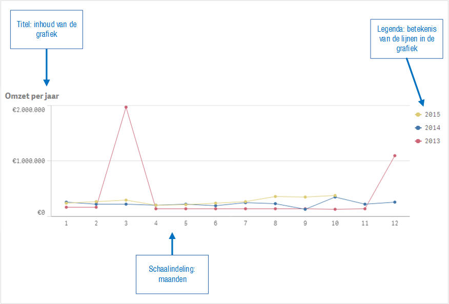
- If you hover with the cursor above a part of the graph (do not click), you see a text balloon with extra information.
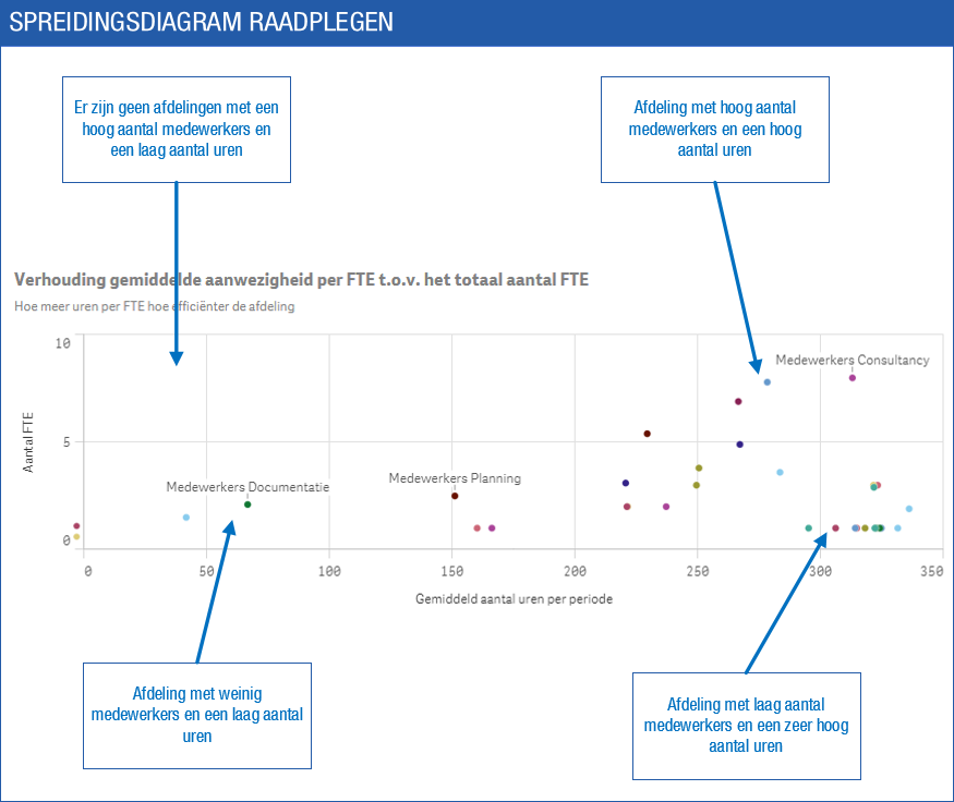
Scatter chart
A scatter chart shows information based on horizontal and vertical axes. This chart type is ideally suited for comparing data and detecting peaks. For example: do any of the departments have an abnormally high absence rate or do any of the sales representatives realise an abnormally high turnover?
To view a visualisation:
The points in this visualisation represent departments. Look at the scaling on the horizontal and vertical axes to understand how you should interpret the visualisation. The horizontal axis indicates the number of hours, the vertical axis the number of employees.
See also
|
Directly to
|